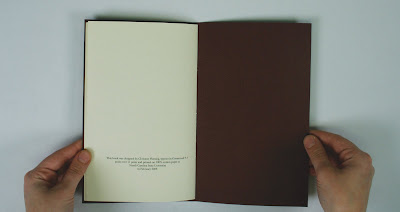
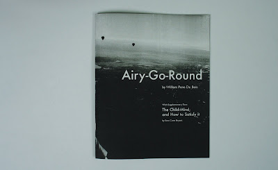
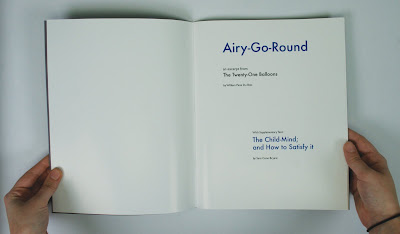
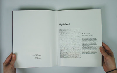
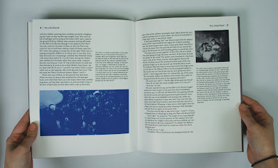
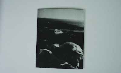
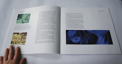
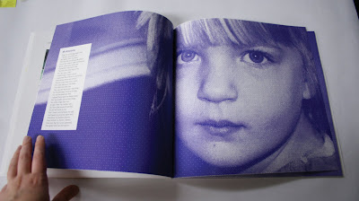
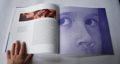
Project 02- Culture BookFor this project we had to read a lot of readings on visual culture and such and then through numerous essays and more readings, we came to our own individual topic. We then wrote our essay on that topic, and everyone posted their essay to the class blog. Then we each picked 6 of other peoples essays that were somehow related to ours, and had to compile them into a book. We could choose to use pieces of their essays or the whole things; i chose to use their whole essays. The theme holding the essays together, and also the title, is
How We've All Been Duped. The essays talk about companies/society "duping" you into thinking things that aren't true. Plus i got to use this awesome typeface, Simcha, that ive been dying to use all semester. We had to use all the book making knowledge we had from all our books in typography, plus we had to have at least 2 sections (i had 3) each with openers, and a table of contents.
We also had to perfect bind our books which was a new production technique for us. It was so stressful the first time! To perfect bind: first you square up the pages to make them aligned, then you secure them with two wooden blocks. Then you bend the pages over and brush book making glue on the edges, and then turn the pages over the other way and brush glue on again. the you set the pages straight into the air and put wax paper and plexi glass over the tops and let it dry over night. The next day you take the plexi glass and wax paper off and put another layer of glue on the spine and let it dry 3 hours. Then put another layer of glue and let dry 3 hours. Then its bound! Then you just glue the cover to the spine and let dry 3 hours. Heres the set up after i took off the plexi glass and wax paper.

And just as a side note, i think i did every single production step twice because I messed it up everytime the first time. The first time i printed the book (all 40-something pages) i accidentally added an extra page at the beginning of the indesign file, so every spread had the wrong two pages on it. So theres goes $15. Then the next time I printed it out it printed perfectly, and I got to the binding and did every step (a 24 hour process) before i realized i bound the book on the wrong side. There goes another $15. Then I printed the book again, bound it completely again, and then glued the cover on
backwards and didnt realize it until after it was dry. Thankfully it came off cleanly and I just reglued it without having to print AGAIN. You would think after the first mistake i would have learned my lesson. I think i was just overly stressed. oh well!
These arent all the spreads, theres really like 45 pages.


 Project 03- Learning Game
For this project we were to choose a college level course that we were currently taking or had taken a previous semester, and create a game around it to help the class be taught. I chose my self-defense class, which I knew would make an awesome game. The class is geared towards girls and how to defend yourself against robberies, fights, rape, or someone trying to kill you. So the class itself is pretty serious, but we also have a lot of fun in the class, so i wanted the game to walk a fine line between funny and serious.
Here are the directions (that are printed on the inside of the box):
1. This game can be played with 2-4 players.
2. Pas out the “Attack” cards so that each player has 3 cards. Set the rest of the deck aside. Study your cards.
3. Set the “Senario” deck in the middle of the playing area.
4. Flip over the first Scenario card. Each player studies the scenario and quickly decides which attack in their hand best fits the situation. Each player lays down that card as soon as they decide.
5. Players then look at the other cards played. Sometimes it will be obvious which attack is best, but if there is more than one appropriate attack played, the players must debate on which attack is best until an agreement is made between all players.
6. The winner of that round takes the scenario card.
7. Players then discard the attacks played and draw a new attack card so that you always have 3 cards.
8. If a player doesn’t have an appropriate attack card, they can choose not to play a card, but they forfeit the chance of winning that round.
9. The game is over when all the attack cards are gone or all the scenario cards have been played. The winner is the player with the most scenario cards. If there is a tie the two players must fight to the death.
The packaging.

Cards in packaging, and directions.


These scenario cards were so fun to make... especially the ones of justin pulling megan into the woods by her hair. I wanted the scenario cards to be photographs because they represent the real life situations and represent the player having to analyze the situation. There are really 8 cards, but i just photographed 4.

The back of the attack cards.

The front of the attack cards. These were also really fun to make. I took a bunch of people down to the photography light room and took pictures of them doing the self-defense moves on the green screen. Then I made them into black and white silhouette type images in photoshop. I wanted them to be more vector like instead of photographs because they represent the move, not the situation the move is in. A vector image takes a lot of the detail and situation/reality out of the image. On the card there is also the name of the move and a description of the move. The description is where a lot of the playfulness came into play. There are 16 cards, 8 pictured here.


Everything together!


 A swing/chair in an art and design studio. i had permission to sit in it... really...


 Ok well, there's my blog purge. Hundreds of hours of work (and play) all put into a blog in one day. This summer I am going to try to do a blog post 5 times a week at least, maybe even every day. Im going to also try to draw/paint/make something every day. Summer is for art! I've got lots of materials ive been saving, like wood to do some audrey kawasaki inspired paintings. And of course I have my obsession with jellyfish and siphonophores—that will come into play im sure.


