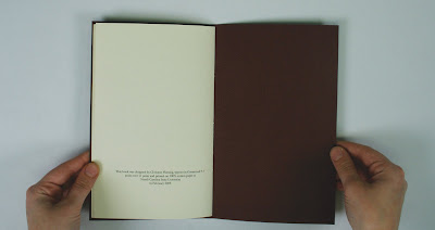
Wow I haven't posted typography pretty much all year. Well here they all are! We first had to select a text pre-1950. I chose a chapter from The Twenty-One Balloons titled Airy-Go-Round. We then had to design a traditional book using that text, which means using traditional page proportions like the Golden Rectangle, simple book covers (I embossed my cover), centered text paragraphs that form a point at the bottom, old style typefaces, and other traditional techniques. We also bound the book traditionally using a hammer and nails to make three wholes, then bind it together using book makers string.
Cover page:
Project 02: Modern Book
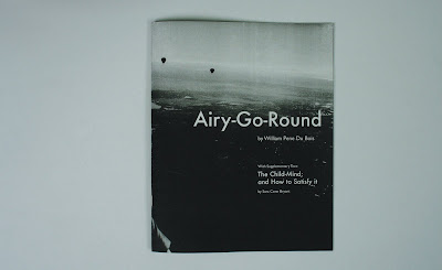
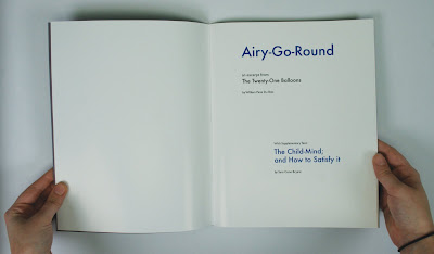
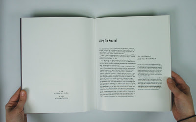
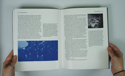
Then as a continuation of this project we had to create a modern book using modern book design techniques, using the same text as before as the main text, and we had to find another relevant text to be a supplementary text. My supplementary text was an excerpt from a book on how to read stories to children, which tied in nicely because The Twenty One Balloons is a childrens book and the chapter I chose is all about children. We implemented lots of modern techniques such as modern typefaces (sans serifs), left aligned paragraphs, color type, photographs, and duotones. We staplebound the book with a machine in the letterpress room.


Project 03- Image Book
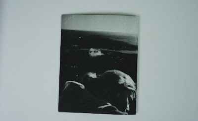
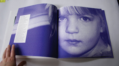
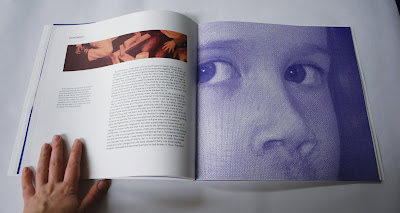
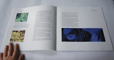
For this book we had to take our supplementary text from our last book which now became the main text for this book, then we had to find a new text to be the supplementary text. For my supplementary text I chose an essay written in the 1930s-ish about child imagination and how it can be a good thing, which of course now we know it is, but at the time it seems Mothers were quite concerned with their childrens imaginations. So the whole book is about children, imagination, and how reading stimulates their imagination. We used modern techniques, and we also had to create a neologism for the title. A neologism is basically two words smashed together to make one word. At first my word was Imagook, which was imagination and book, but at a interim critique I was informed that gook is a deragatory word towards vietnemese people (from the vietnam war). So i had to change my neologism, and I used my second choice, Bomagination. But I like that one too, its fun to say. We also had to take an existing typeface and change it to make it relevant to our neologism, and set our neologism in that new typeface. So I used Geo Sans Light, made its line weight thick, and in illustrator made it look like those letters that kids always draw on their desks at school. And this book is where those preschool pictures went. So its all my own photography. And for the cover i drew what i thought any little girl would have drawn if you gave her a sheet of paper: unicorn, fairy, princess, castle, cat, and butterfly. The book also had to be 100 square inches, which is pretty big for a book. Oh and we had to perfect bind it, which takes forever! See the studio entry for more on perfect binding.


Project 04: Essays
We wrote some essays. I wrote mine on Kyle Cooper who is the GOD of movie titling. He's amazing. He's basically done the titles to every good movie you've ever seen.
Project 05:
As our final project we had to create a typeface that is inspired by our game we were simultaneously creating in studio. My game was based on my self-defense class, and a big part of that class is to learn to walk confidently and be strong. So i created the letters to be big and bold. Another big aspect that was really the whole basis of the typeface, is that I wanted them to look hard to push over, that they could stand their ground. So they are all based off a square, with pieces taken out to make the letters.

We also had to set the letters into words. And Martha said our first type project next semester is going to be refining this typeface and putting it into typetool so that it is a usable typeface.



No comments:
Post a Comment